The Shropshire menswear designer talks David Hellqvist through her RAF influences and art school aesthetic

Photography Christian Alegria
There’s always a narrative behind my collections. This one’s about a Royal Air Force kid who, because of his family moving from base to base, doesn’t really have a true foundation in life – there’s no sense of home. It made me think about growing up in Shropshire where we had an army base a couple of miles up the road. At the beginning of each school term, there would be a bunch of new kids who we befriended, but they always had to move on and it was quite heartbreaking, especially for them. The collection is about that nomadic kid who’s trying to find his home, a sense of stability and a place where he belongs.
In the narrative, the RAF pilot dad has this idea that the son wants to follow in his footsteps. But actually, the son doesn’t want to do that. Although he’s fascinated with the machines and the technology behind the planes, he doesn’t want to fly them. He ends up going to art school but he still admires the machines, technology, mechanics of the aviation industry. The result is this dark undercurrent of being a misfit trying to fit in, attempting to find stability – and I think it’s something we can all relate to.

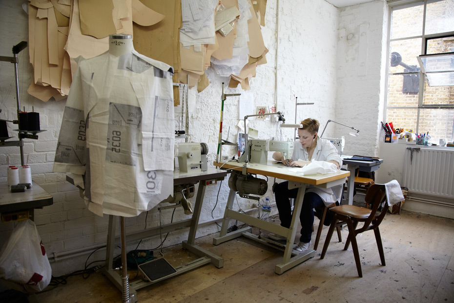
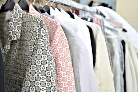
Based on that, we created a print which came together when my stylist, John McCarthy and I went to the RAF museum in Hendon. One digital print is based on the branding and stencilling that you can see on the machines, different letter and number combinations from the 40s, and even older planes. We turned them around so the prints had less actualmeaning and more focus on the aesthetic. Other prints were based on plane tyres. The tyres we saw in Hendon were different from the ones you’d see these days because during the war, the planes didn’t take off and land on modern concrete airfields – it was mostly just a field – and the tyres had to be able to handle that. One of the tyre prints is from the legendary Lancaster bomber, which we saw at the museum. I was very adamant that if we were sticking with this RAF association, it had to feel contemporary. After last season, I felt that we had to keep on pushing forward. I don’t want the brand to be pigeonholed. I’ve been inspired by uniforms before, but this time around I wanted something lighter and more relaxed. There is tailoring in this collection but it has a slightly more boxy fit. They’re made from the same block I normally use, but they’re a lot easier to wear.

The art school story is visible in some of the tailoring as well, a sort of idea of homespun creativity; you can see it in the shrivelled, painter scrub linen jackets. They’re made so that the interior becomes the exterior – I wanted to show the construction process and engineering that goes into making them. They look like they could have been worn either by an artist in his studio or a mechanic doing up a plane. I really like the dirty-looking coat, it looks like it’s got tea stains on it. And we’ve continued the western style jackets. There is even one in terry cloth which I’m yet to decide upon – but the fabric makes sense in home furnishing kind of way. The collection is about an art school kid who rebels against life as we knows it and, along the process, finds himself and his identity.


