Creative director Kuchar Swara runs through five things he’s enjoyed at Port in 2013
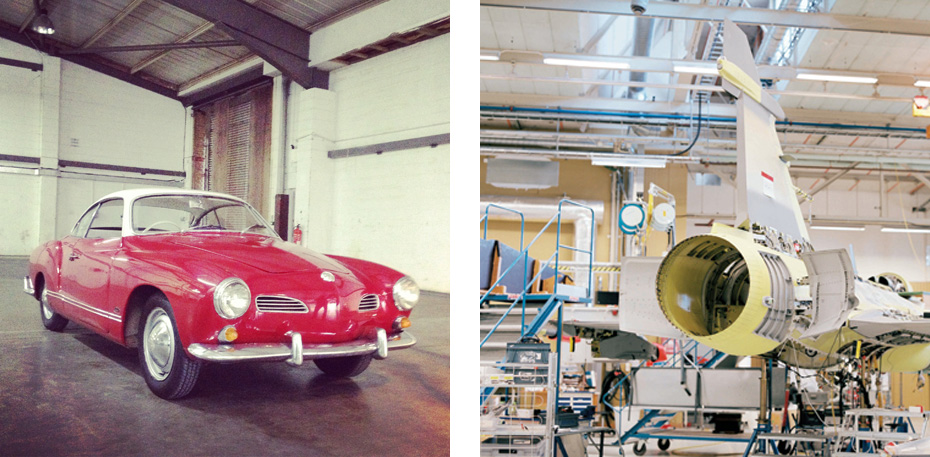
 Delving deeper into features; example: ‘Something in the Air’. Going to the point of analysing the Airbus A380 manufacturer’s manual and looking at the mechanics of how to use the aircraft (admittedly my take off and landing still needs practice).
 Initially a theoretical experiment between issues (10 and 11) and a reaction to mainstream magazine design, Port’s design went into reduction mode. All typefaces except our body text font (Quadraat) were removed. The use of colour also reduced to black only, with accent use of the house red. The result, for me, was quite interesting: graphic tools made for book design, used in a magazine context. We have attempted to take this further in issue 12 by using the text face at larger display sizes and introduced an accent sans serif (Atlas, Designed by Kai Bernau, Susana Carvalho and Christian Schwartz) for special supplements.
 Driving classic cars around London for our shoot back in May with Michael Bodiam.

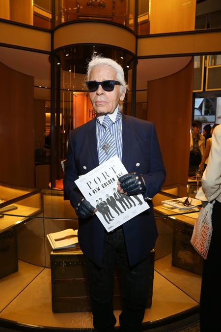
Karl Largerfeld attending our issue 10 party in Paris at the Moynat store.

Port Publishing ending the year 38% up on 2012.