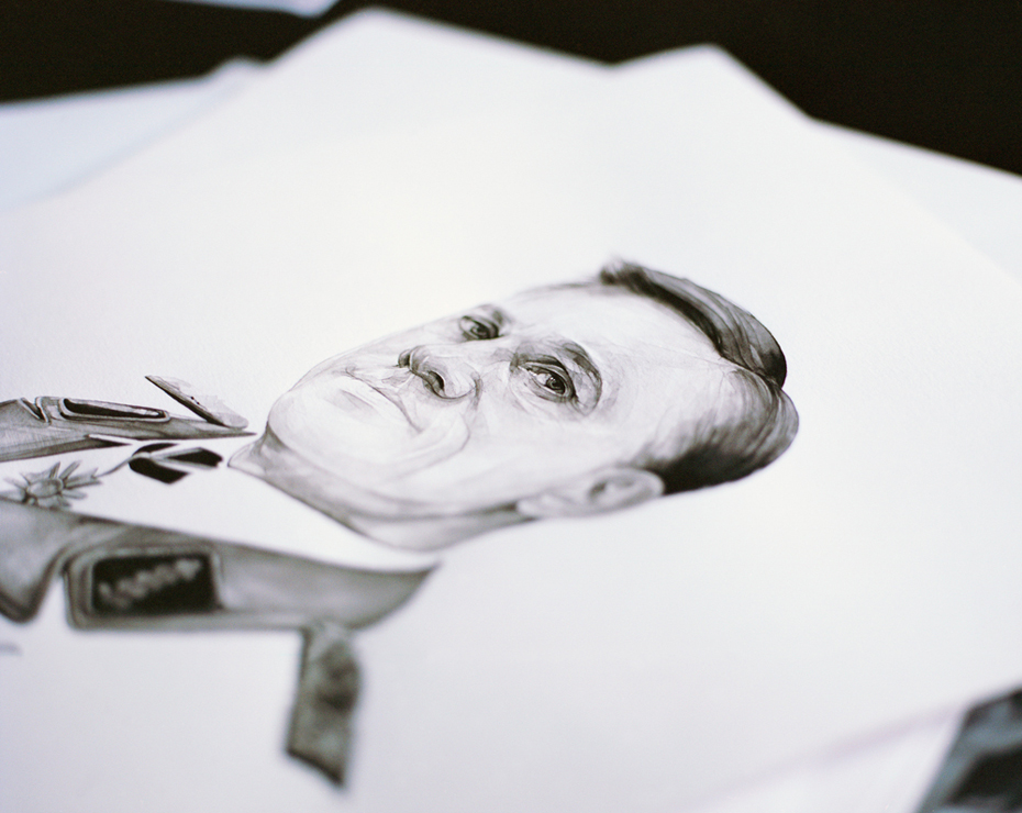
A few weeks we interviewed illustrator Jason Ford who’s worked in the industry for nearly 25 years. Now we talk to Kate Copeland, who – despite graduating only four years ago – has steadily established herself as a go-to portrait illustrator for magazine and book publishers with her soft, intricate monochrome paintings. Photographer Liz Seabrook and Betty Wood went to Kate’s Stoke Newington studio to discuss the peaks, and pitfalls, of life as an independent illustrator, and why – for her – a day lost to drawing is bliss.
Betty Wood: How did you become an illustrator?
Kate Copeland: When I was a kid, my mum would sit and paint watercolour flowers, and I’d sit and watch her for hours. She looked so happy doing it, and I knew I wanted to be able to do that, too. It was that that made me want to be an illustrator rather than a professional in the industry – there’re photographs of me in the garden, aged four, big shades on, pens and pencils in my hand; I always had a pen in my hand.
It wasn’t until my A Levels, when my tutor said to me, “Take yourself seriously as an artist”, that I realised, OK maybe I can make a career out of this, pursue this seriously. So I studied illustration at university, as I thought illustration was best-suited to me as it’s drawing-based.
Betty: Who have you worked for?
Kate: Since I graduated in 2010, I’ve had a fairly consistent stream of work, including commissions for Converse, The Times, *Wallpaper and Port. I’ve worked with Sagmeister & Walsh; some really cool people that I wouldn’t think would be emailing, especially as I was ‘new’ and fresh on the scene. I’ve just done a cover for Huck magazine, which was amazing. I never thought I’d do a cover; when I saw it in the shop, I was so excited; I had people sending me messages saying “I knew instantly it was your work”. That was the best thing to hear, so nice.
 Betty: Tell me about your style of illustration, and how you work.
Kate: I’m very minimal: in this industry, you have to scan your work digitally, so I do have to do that end edit on the computer… but if I didn’t have to use a computer at all, then I wouldn’t. Maybe that’s because I’m not that great on Photoshop, or maybe it’s just the tactile quality of print that I like. I think as soon as it hits the scanner, it loses something. If I could hand out the originals, I’d love to do that
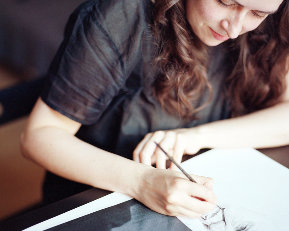
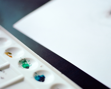
As for my style, it’s all very simple – sketch one drawing, then paint into it. I used to paint a lot before university – during university I completely switched, and concentrated on pencils. My move back to paint was due to commissions and time constraints; it made it a lot quicker to put quick marks down rather than working with pencils.But I’ve re-sparked a passion for working with paints – there’s something about watercolours, about sculpting a face; that first watercolour mark… You can’t ‘undo’ it, you’ve got to have that nervousness and the confidence to just go and do it. And that I love. Of course, there are disasters. I can’t count the number of times I’ve spilt coffee on my work, and had to start again…
Betty: Do you follow a routine?
Kate: No. I forget it’s my ‘9-5’ and that it’s a ‘job’, and I can easily lose the day; I put my headphones on and I paint and that’s it… Sometimes I forget to eat lunch I’m so focused on what I’m doing… And I can paint into the night…
Betty: What are you currently working on?
Kate: I’m mainly a portrait artist, but I’m working on a fashion piece at the moment. There’s nothing in my portfolio that suggests I’d be good at that – it’s people just asking, and me doing it. It’s not my immediate comfort zone but I like to do them as it takes me away from doing the same old thing – I want to be challenged. There’s a different level of detail in the clothing required that I can then apply to the portraiture. I’m trying to get more detail into my portraits and stuff, so they’re feeding each other, which is quite nice.
Betty: What’s the most interesting project you’ve worked?
Kate: Sagmeister & Walsh – they were a dream client. Working for such an iconic graphic design firm was a real pleasure. Especially because it wasn’t portraiture, and it wasn’t for print. They were illustrations to be hand printed onto the bottom of whiskey tumblers. It was so different; 14 illustration for seven deadly sins, seven heavenly virtues. These glasses are hand painted and ridiculously expensive – they sell them at Barney’s in New York. That was 18 months ago, and I still feel so excited and satisfied about that job. They originally did the set just using photographs, but they were inconsistent, so they opted instead for hand-painting them in a style of illustration that could be replicated for consistency. I drew curves and lines that they could copy. A couple of weeks after the commission, I went to New York and I did visit Barney’s and asked for them, but they hadn’t come out yet…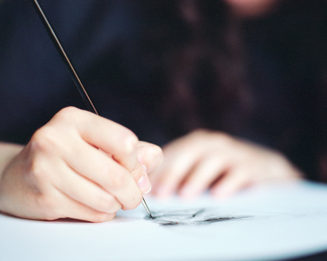
Betty: Do you keep all your originals?
Kate: I have started to filter; I’ll paint something, finish it and then a week later say to myself ‘I can’t believe you did that! I can’t believe you sent that off to a client’. I’m my worst critic. But I do keep stuff; my tutors told me never to throw anything away. I’ve only got a small flat, I don’t want to drown in paper…
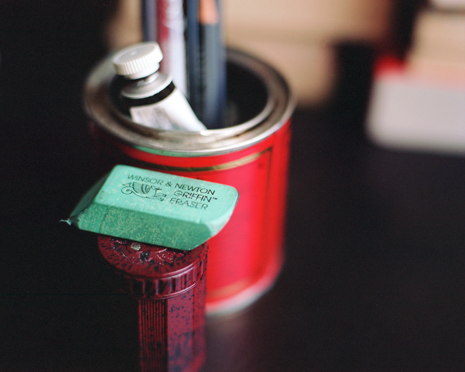
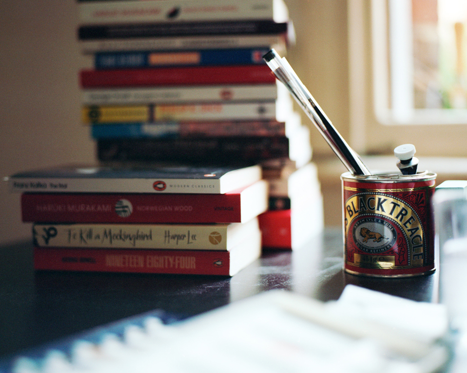
Betty: And you keep a really tidy desk!
Kate: Yep. The whole flat is empty and clean; I’m a neat freak. I can’t concentrate around clutter; I just need my drawing in front of me.
You can see more of Kate’s work here
Photography Liz Seabrook


