George Upton discovers the inspiration behind Berluti’s AW19 collection for our latest issue
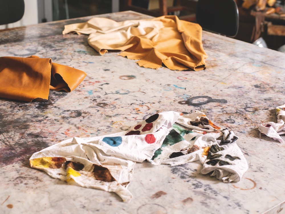
In Berluti’s manufacturing facility in Ferrara sits a wide, square marble table, stained with intersecting rings of colour – semicircles of blue and orange and yellow, arcs of pink and green, dark circular smudges, sunk into the stone. It’s a hard, cold surface, smooth and unyielding, a visual record of the work of the brand’s master colourists, who are responsible for applying Berluti’s distinctive patina to the shoes by hand. It is also, for Kris Van Assche – the creative director of the Italian-founded, Parisian maison – a source of inspiration: His collection for Berluti this autumn centres on a print made from an image of the table, repeated across shirts, suits and coats, the smudged colours providing the palette for the rest of the collection.
Developed in the ’80s by Olga Berluti, who inherited the brand from her grandfather and uncle, the patina is a closely guarded secret involving a combination of solvents, essential oils, pigments and dyes that are applied to the leather. Designed to age with time, to evolve as the shoe is worn, the process creates unique shades and nuances in the leather, as well as, under Olga’s direction, facilitating the introduction of a new, vibrant spectrum of colours to sit alongside the traditional black and brown.
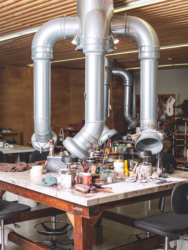
One of the master colourists at the Berluti factory took Port through the process:
First and foremost, it’s vital to use good-quality products. The material we use, Venezia leather, was developed by Olga Berluti. It is full grain and uncoated, which makes it a perfect base for the patina. We start by lightening the shoe, stripping it back, before we massage it with essential oils that are imbued with natural pigments and different types of wax.
Then, using brushes, sponges and cloth rags, we start colouring. The patina effect we often apply, which we call ‘cloudy’, requires two types of colour, one that is transparent and another that we call ‘smoky’. The transition between the two has to be as smooth as possible; to find the perfect balance can take well over an hour.
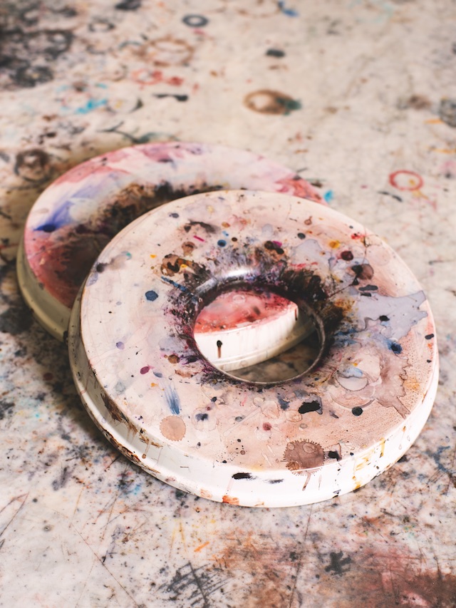
Lighter colours are more difficult to master, as even the slightest flaw shows up, and multicoloured patinas can be particularly demanding as many different colours are needed to achieve the best transition. The biggest challenge, however, comes with dramatic colour changes, such as brown to red, on a pair that has already been worn a lot. On Kris Van Assche’s SS19 collection, he introduced ‘reversed patina’: a base of very dark black on to which brighter colours are added (blue or red for this range). The colour placement has to be carefully considered, depending on the shape of the shoe, so the transition to black remains beautiful.
Photography Piergiorgio Sorgetti
This article is taken from issue 24. To buy the issue or subscribe, click here


